Ubuntu - Childminding

“I am, because we are”

Objective & Branding

Candice is a passionate and enthusiastic childcare practitioner with a love for outdoor learning.

She has been working with babies and young children for 22 years and her experience ranges from working on summer camps in the USA, being a nanny, to managing a large nursery and after school clubs. She prides herself on providing early learning and childcare that meets the individual needs of each child.

Working with the carers and children to ensure experiences are relevant and meaningful, which includes first hand experiences in the ‘real world’.

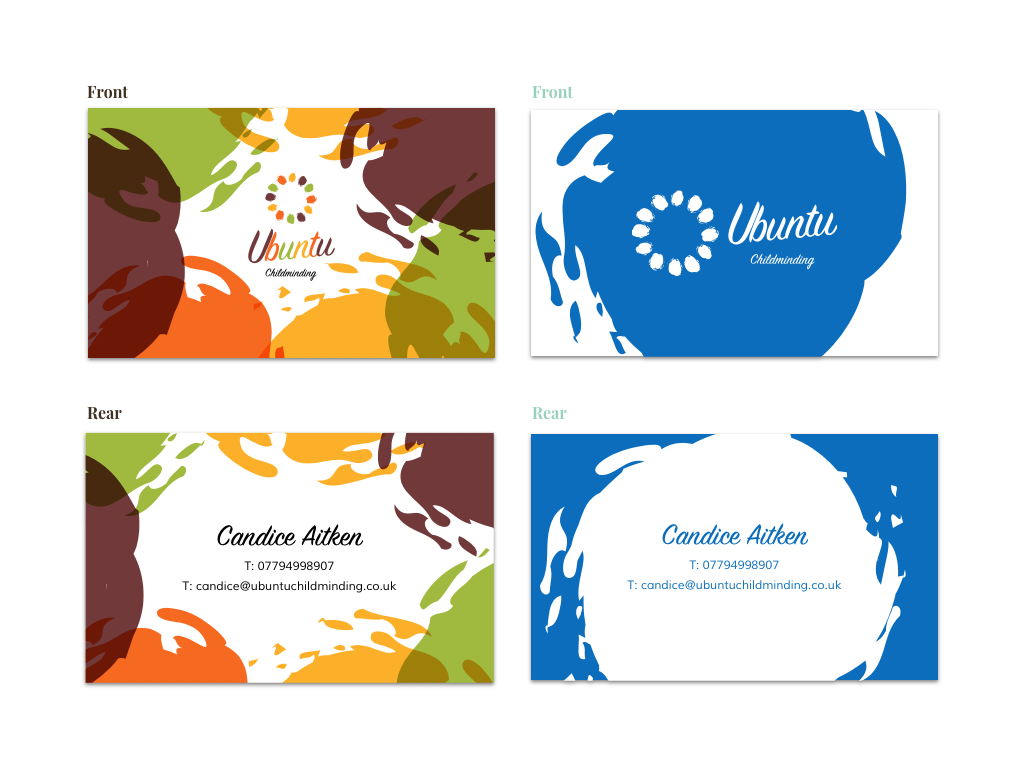
Candice initially asked me to build her a website. I was happy to oblige but when asked about her brand expectations, it was clear she also needed to do a bit of work in this space.

I wanted to help her establish herself as a professional childminder in the area, appealing to local parents, old and new alike, whilst creating a fun and engaging brand identity which would be remembered by the children in her care.

Identity-Hero

The brief

Understanding the philosophy: 

This is where everything starts for me. I spent a lot of time trying to convey Candice’s personality (professional and fun) for her target audience (new and existing parents in the local community).

Candice’s philosophy of Ubuntu (meaning “I am. because we are.”) is an integral part of her business. Her ideology is all about influencing the community in a child’s life, supporting individual growth and ultimately adding a safe place for a child to learn and be themselves.

We spent time together sketching out many ideas, eventually settling on the one on the left. I setup a variety of options for her to make use of the logo. Respecting that her clients may not be affluent, I opted to provide high contrast versions to save on printing costs.

All artwork was vectorised and her colour pallete, which eventually reflected her South African roots, was also prepared for print making use of a process version, a Pantone version and an RGB version for screens.

Logo variations

Logo variations

Visualising the brand

It was important that Candice took the time to realise the implications of her brand. I spent time working with her on understanding both the business costs associated with print materials and the value they can bring when done the right way. As a self employed person, these additional costs could have a huge impact on her business. My recommendation was for her to start small. 

We agreed the specifics of when and how her logo was to be used, defining differences in layout and I provided guidance on how she would be able to replicate it in future. 

The project is still ongoing and the brand is going from strength to strength.

T-Shirt mockup

Tote bag mockup

UbuntuStationery

Stationery

Business Cards (full colour and single tone)