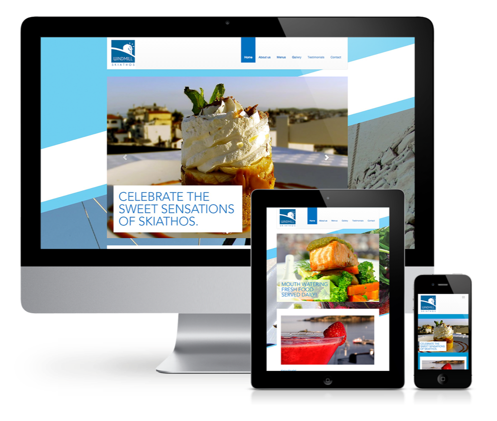
The Windmill restaurant on the island of Skiathos was looking to improve their overall brand identity and engage customer in new and fresh way. Out with the old and in with the new.
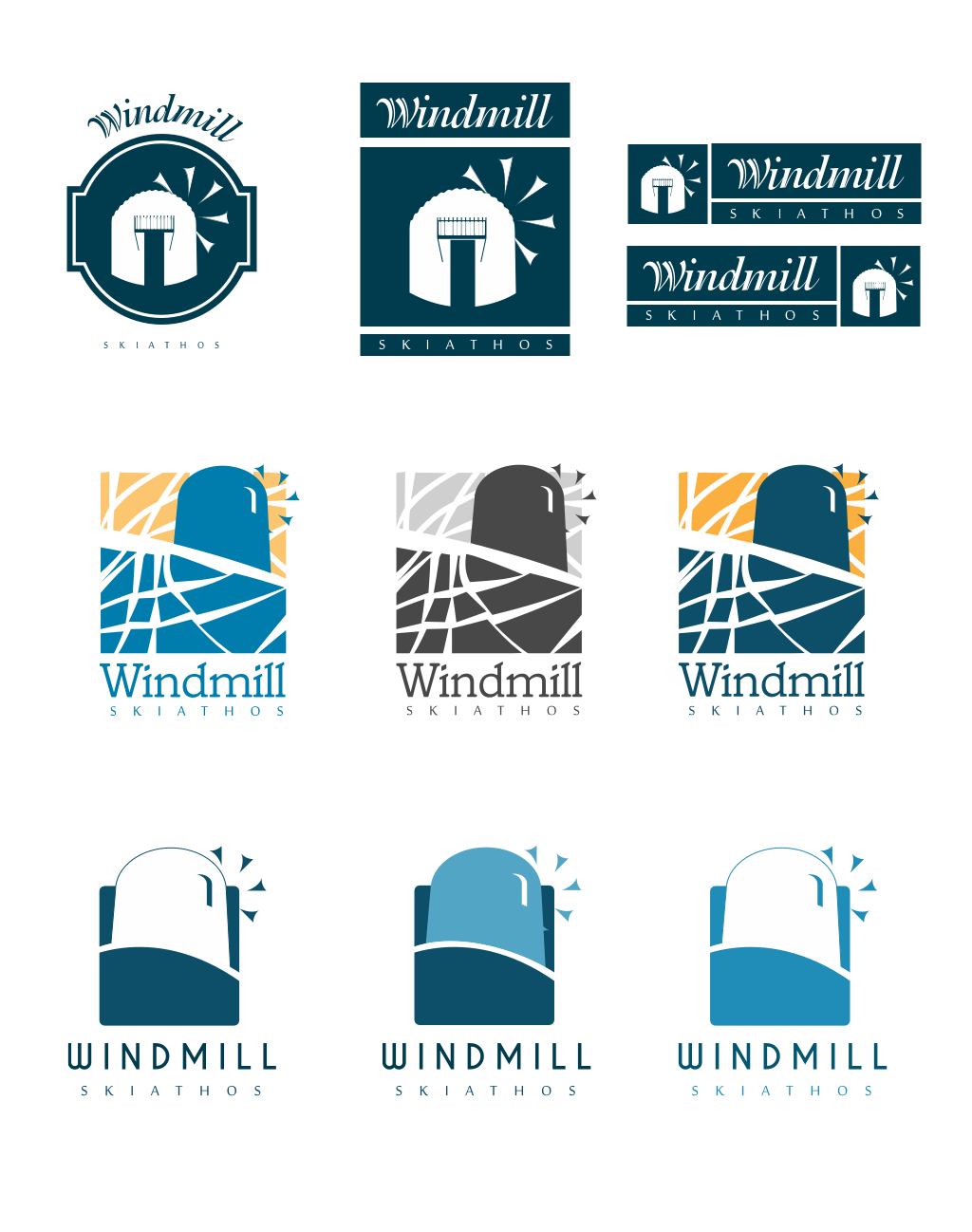
Round and round like a windmill
Iteration played a large part of this process. I explored about 10 different solutions for Karen.
It was important for me as a designer that the owner felt I had captured the feel of her restaurant in the logo
Spot colours were used in the print process.
The logo elements were created as Illustrator symbols for re-purpose. They would like to use symbolism in other ways in future.
Careful attention was paid to use the logo in light or dark settings.
Typography was important here and needed to be simple. I felt the use of a sans-serif typeface and balanced point size reflected the unique style of the restaurant.